CodeLab: Resume Parser
Available for work
CodeLab: Resume Parser
Available for work
Category:
Product Design
Client:
CodeLab Spark Team

🎯 Project Overview
Resume Parser is an AI-powered web tool designed to help job seekers create ATS-friendly resumes. It offers smart parsing, feedback on content and formatting, and tailoring suggestions based on job descriptions.
My team and I created Resume Parser through CodeLab at UC Davis, a student-run agency focused on professional product development.
Timeline: Jan 2024 - Jun 2024 (20 weeks)
Team: 5 Developers, 2 Designers, 1 PM, 1 Mentor
My Role: UX Designer · UX Researcher · Product Designer
Tools: Figma · AirTable · Google Suite · Slack · Jira
🧠 The Problem
Most job seekers struggle to create resumes that meet ATS (Applicant Tracking System) standards. These systems often reject resumes that don't follow specific formatting or language rules — without the applicant ever knowing why.
We found three major pain points:
Lack of tools that extract relevant resume data effectively.
Poor, unclear feedback on resume quality.
No easy way to tailor resumes to specific job descriptions.
🔍 Research & Insights
📊 Market Research
We started by researching ATS systems and how widely they're used. I was honestly shocked to learn that 99% of Fortune 500 companies use them. It helped me understand that the stakes were high for job seekers — and that good design here could really make a difference!
🕵️ Competitive Analysis
I led a breakdown of three top resume parsing tools. My goal wasn't just to look at features, but to understand the user flow and emotional tone of each tool.
Key Takeaways:
Parsing styles vary between content-based and formatting-based, but not both.
Vertical layouts work well for onboarding; horizontal layouts shine for detailed feedback.
Consistent UI elements like whitespace, color themes, and intuitive buttons make tools feel reliable and easy to use.
My Thinking:
I wanted our tool to feel clear, transparent, and human-centered. That meant showing users exactly what changed, and letting them choose what feedback mattered most to them.
📋 User Survey (42+ responses)
I co-designed and distributed 19-question survey, collecting over 42 responses from job seekers, especially college students.
Key Stats:
69% of users want to tailor resumes for specific job descriptions.
57% of users expect feedback on word choice, phrasing, and conciseness
What I Learned:
Users didn't just want to be told "what's wrong" — they wanted to learn how to fix it. This shifted our design from a passive parser to an interactive feedback experience.
🧩 Ideation
🧍User Stories
Based on our research, I prioritized user stories into three tiers:
High Priority:
Receive clear feedback immediately
Tailor resumes to job descriptions
Choose specific feedback categories
Medium:
View history of uploaded resumes
Low:
Upload multiple resumes at once
My Thinking:
This prioritization was tough, especially because we had so many exciting feature ideas. But staying focused on what actually helps the user was the main priority.
🖼 Wireframing & Design System
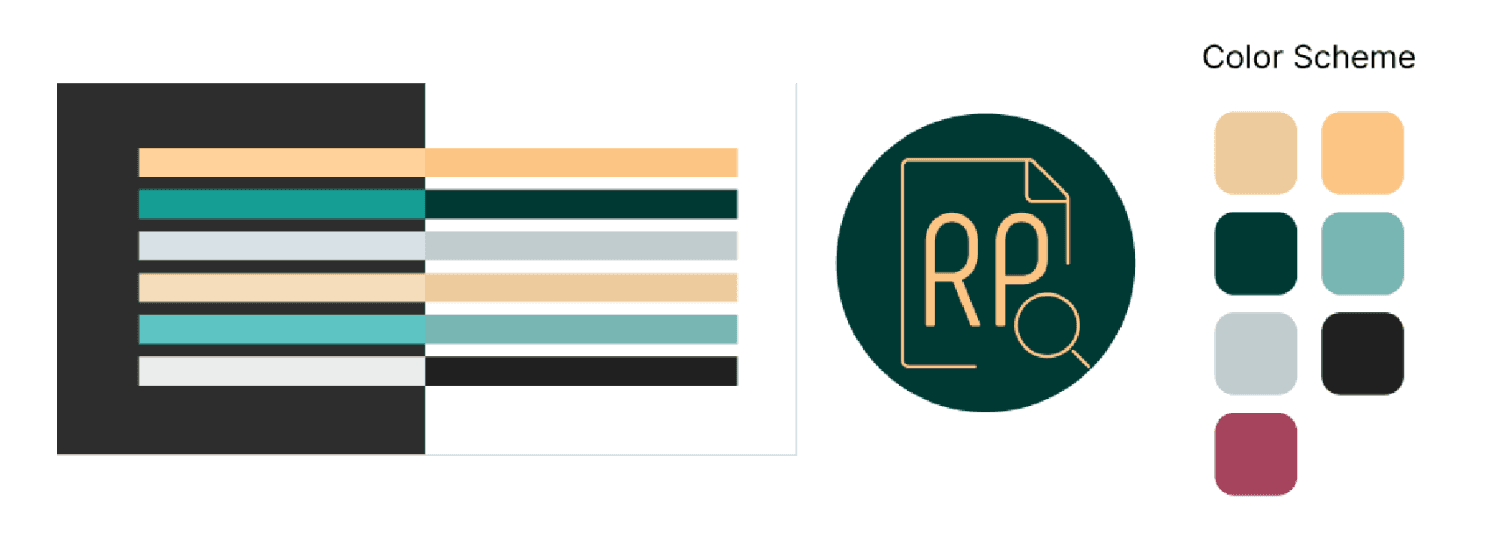
I created low-to-high fidelity wireframes in Figma, iterating quickly based on team feedback. I also helped establish a small design system to keep our visuals consistent — things like buttons, color palette, spacing, and typography.
What I Learned:
Working closely with developers meant I had to be precise and intentional with my designs, especially with interactive elements like toggle states and parser views.
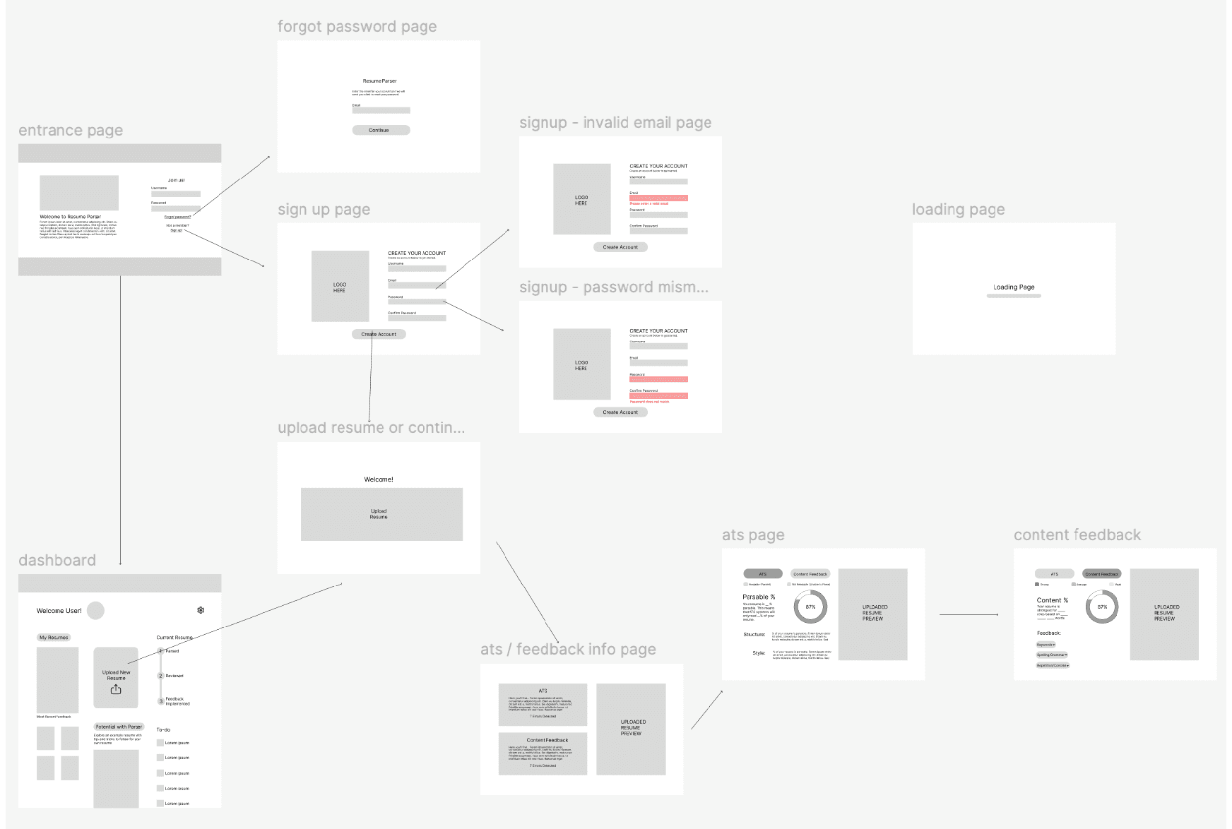
✨ Final Designs
Key Features:
Feedback Comparison: Users can toggle between content-based and syntax-based feedback.
Content Feedback: Breakdown by category (e.g. action words, phrasing, repetition).
Dashboard: Shows job matches, ATS scores, and a resume optimization to-do list.
My Thinking:
I designed the dashboard to act like a career progress hub — something encouraging, not overwhelming. I wanted it to feel like "You're getting closer", "Progress over perfection", and "Keep going".


🧗Challenges & What I’d Do Differently
Due to time constraints, user testing was limited to the landing and sign-up pages. With more time, I would:
Conduct in-depth usability testing on key flows (dashboard, feedback screens).
Expand testing to a more diverse pool of job seekers.
I would also explore:
A resume generator tool using AI based on uploaded job descriptions.
Clearer toggling between “resume tailoring” vs. “standard parsing” modes.
More advanced job-matching recommendations.
🌱 Reflections
This project taught me how to balance user needs, technical feasibility, and AI capabilities in a high-stakes, real-world problem space. I learned how to turn user data into product direction, collaborate with a cross-functional team, and deliver a tool that empowers job seekers.
🎯 Project Overview
Resume Parser is an AI-powered web tool designed to help job seekers create ATS-friendly resumes. It offers smart parsing, feedback on content and formatting, and tailoring suggestions based on job descriptions.
My team and I created Resume Parser through CodeLab at UC Davis, a student-run agency focused on professional product development.
Timeline: Jan 2024 - Jun 2024 (20 weeks)
Team: 5 Developers, 2 Designers, 1 PM, 1 Mentor
My Role: UX Designer · UX Researcher · Product Designer
Tools: Figma · AirTable · Google Suite · Slack · Jira
🧠 The Problem
Most job seekers struggle to create resumes that meet ATS (Applicant Tracking System) standards. These systems often reject resumes that don't follow specific formatting or language rules — without the applicant ever knowing why.
We found three major pain points:
Lack of tools that extract relevant resume data effectively.
Poor, unclear feedback on resume quality.
No easy way to tailor resumes to specific job descriptions.
🔍 Research & Insights
📊 Market Research
We started by researching ATS systems and how widely they're used. I was honestly shocked to learn that 99% of Fortune 500 companies use them. It helped me understand that the stakes were high for job seekers — and that good design here could really make a difference!
🕵️ Competitive Analysis
I led a breakdown of three top resume parsing tools. My goal wasn't just to look at features, but to understand the user flow and emotional tone of each tool.
Key Takeaways:
Parsing styles vary between content-based and formatting-based, but not both.
Vertical layouts work well for onboarding; horizontal layouts shine for detailed feedback.
Consistent UI elements like whitespace, color themes, and intuitive buttons make tools feel reliable and easy to use.
My Thinking:
I wanted our tool to feel clear, transparent, and human-centered. That meant showing users exactly what changed, and letting them choose what feedback mattered most to them.
📋 User Survey (42+ responses)
I co-designed and distributed 19-question survey, collecting over 42 responses from job seekers, especially college students.
Key Stats:
69% of users want to tailor resumes for specific job descriptions.
57% of users expect feedback on word choice, phrasing, and conciseness
What I Learned:
Users didn't just want to be told "what's wrong" — they wanted to learn how to fix it. This shifted our design from a passive parser to an interactive feedback experience.
🧩 Ideation
🧍User Stories
Based on our research, I prioritized user stories into three tiers:
High Priority:
Receive clear feedback immediately
Tailor resumes to job descriptions
Choose specific feedback categories
Medium:
View history of uploaded resumes
Low:
Upload multiple resumes at once
My Thinking:
This prioritization was tough, especially because we had so many exciting feature ideas. But staying focused on what actually helps the user was the main priority.
🖼 Wireframing & Design System
I created low-to-high fidelity wireframes in Figma, iterating quickly based on team feedback. I also helped establish a small design system to keep our visuals consistent — things like buttons, color palette, spacing, and typography.
What I Learned:
Working closely with developers meant I had to be precise and intentional with my designs, especially with interactive elements like toggle states and parser views.
✨ Final Designs
Key Features:
Feedback Comparison: Users can toggle between content-based and syntax-based feedback.
Content Feedback: Breakdown by category (e.g. action words, phrasing, repetition).
Dashboard: Shows job matches, ATS scores, and a resume optimization to-do list.
My Thinking:
I designed the dashboard to act like a career progress hub — something encouraging, not overwhelming. I wanted it to feel like "You're getting closer", "Progress over perfection", and "Keep going".
🧗Challenges & What I’d Do Differently
Due to time constraints, user testing was limited to the landing and sign-up pages. With more time, I would:
Conduct in-depth usability testing on key flows (dashboard, feedback screens).
Expand testing to a more diverse pool of job seekers.
I would also explore:
A resume generator tool using AI based on uploaded job descriptions.
Clearer toggling between “resume tailoring” vs. “standard parsing” modes.
More advanced job-matching recommendations.
🌱 Reflections
This project taught me how to balance user needs, technical feasibility, and AI capabilities in a high-stakes, real-world problem space. I learned how to turn user data into product direction, collaborate with a cross-functional team, and deliver a tool that empowers job seekers.


CodeLab: Resume Parser
Available for Projects
CodeLab: Resume Parser
Available for Projects
Category:
Category:
Product Design
Client:
Client:
CodeLab Spark Team
🎯 Project Overview
Resume Parser is an AI-powered web tool designed to help job seekers create ATS-friendly resumes. It offers smart parsing, feedback on content and formatting, and tailoring suggestions based on job descriptions.
My team and I created Resume Parser through CodeLab at UC Davis, a student-run agency focused on professional product development.
Timeline: Jan 2024 - Jun 2024 (20 weeks)
Team: 5 Developers, 2 Designers, 1 PM, 1 Mentor
My Role: UX Designer · UX Researcher · Product Designer
Tools: Figma · AirTable · Google Suite · Slack · Jira
🧠 The Problem
Most job seekers struggle to create resumes that meet ATS (Applicant Tracking System) standards. These systems often reject resumes that don't follow specific formatting or language rules — without the applicant ever knowing why.
We found three major pain points:
Lack of tools that extract relevant resume data effectively.
Poor, unclear feedback on resume quality.
No easy way to tailor resumes to specific job descriptions.
🔍 Research & Insights
📊 Market Research
We started by researching ATS systems and how widely they're used. I was honestly shocked to learn that 99% of Fortune 500 companies use them. It helped me understand that the stakes were high for job seekers — and that good design here could really make a difference!
🕵️ Competitive Analysis
I led a breakdown of three top resume parsing tools. My goal wasn't just to look at features, but to understand the user flow and emotional tone of each tool.
Key Takeaways:
Parsing styles vary between content-based and formatting-based, but not both.
Vertical layouts work well for onboarding; horizontal layouts shine for detailed feedback.
Consistent UI elements like whitespace, color themes, and intuitive buttons make tools feel reliable and easy to use.
My Thinking:
I wanted our tool to feel clear, transparent, and human-centered. That meant showing users exactly what changed, and letting them choose what feedback mattered most to them.
📋 User Survey (42+ responses)
I co-designed and distributed 19-question survey, collecting over 42 responses from job seekers, especially college students.
Key Stats:
69% of users want to tailor resumes for specific job descriptions.
57% of users expect feedback on word choice, phrasing, and conciseness
What I Learned:
Users didn't just want to be told "what's wrong" — they wanted to learn how to fix it. This shifted our design from a passive parser to an interactive feedback experience.
🧩 Ideation
🧍User Stories
Based on our research, I prioritized user stories into three tiers:
High Priority:
Receive clear feedback immediately
Tailor resumes to job descriptions
Choose specific feedback categories
Medium:
View history of uploaded resumes
Low:
Upload multiple resumes at once
My Thinking:
This prioritization was tough, especially because we had so many exciting feature ideas. But staying focused on what actually helps the user was the main priority.
🖼 Wireframing & Design System
I created low-to-high fidelity wireframes in Figma, iterating quickly based on team feedback. I also helped establish a small design system to keep our visuals consistent — things like buttons, color palette, spacing, and typography.
What I Learned:
Working closely with developers meant I had to be precise and intentional with my designs, especially with interactive elements like toggle states and parser views.
✨ Final Designs
Key Features:
Feedback Comparison: Users can toggle between content-based and syntax-based feedback.
Content Feedback: Breakdown by category (e.g. action words, phrasing, repetition).
Dashboard: Shows job matches, ATS scores, and a resume optimization to-do list.
My Thinking:
I designed the dashboard to act like a career progress hub — something encouraging, not overwhelming. I wanted it to feel like "You're getting closer", "Progress over perfection", and "Keep going".
🧗Challenges & What I’d Do Differently
Due to time constraints, user testing was limited to the landing and sign-up pages. With more time, I would:
Conduct in-depth usability testing on key flows (dashboard, feedback screens).
Expand testing to a more diverse pool of job seekers.
I would also explore:
A resume generator tool using AI based on uploaded job descriptions.
Clearer toggling between “resume tailoring” vs. “standard parsing” modes.
More advanced job-matching recommendations.
🌱 Reflections
This project taught me how to balance user needs, technical feasibility, and AI capabilities in a high-stakes, real-world problem space. I learned how to turn user data into product direction, collaborate with a cross-functional team, and deliver a tool that empowers job seekers.