Design Interactive: Threads Redesign
Available for work
Design Interactive: Threads Redesign
Available for work
Category:
Mobile Design
Client:
Meta - Threads (unsolicited redesign)

Introduction
Instagram Threads, a popular social networking platform, experienced rapid growth upon its launch on July 31, 2023. Users were initially engaged, spending an average of 20 minutes per day. However, within just a few months, user engagement decreased significantly, dropping to 18% of its peak, as reported by Sensor Tower.
The main issues here are:
How might Instagram Threads enhance user retention and boost their daily active user numbers to regain and surpass their initial levels of engagement and popularity?
(challenge): How might Threads leverage its integration with Instagram and other Facebook-owned platforms to enhance user engagement and retention?
This 4 week design sprint and unsolicited redesign of Meta's Threads app reimagines the user experience with a focus on a streamlined navigation, enhanced accessibility, and intuitive interaction.
Project Duration
October 2023 - November 2023 | 4 weeks
Team
4 Designers
Completed at Design Interactive, a student-run design consultancy at UC Davis that helps solve pressing challenges for businesses and nonprofits.
Role
UX Designer
UX Researcher
Tools
Figma
Google Suite
Slack
Research
Review Analysis
I conducted a detailed review analysis based on 177,000+ App Store reviews of the Threads app. Strengths and weaknesses of the app are noted below.
Strengths | Weaknesses |
|
|
Competitive Analysis
I also conducted competitive analysis, comparing the feedback from Threads to similar apps such as Twitter, Tumblr, and Instagram.
Tumblr | ||
|---|---|---|
|
|
|
Key Takeaways
Poor navigability — incorporating a search feature including the ability to search for hashtags, new users, and keywords would create increased navigability
Limited accessibility to personalized experiences — incorporating a main relevant trending section + explore page for personalized material and increased community engagement in-app. Also focuses more on personal algorithm to declutter random un-relevant posts
Unintuitive interaction on posts — implementing a more user-friendly interface involving greater attention to detail to likes, comments, reposting abilities, bookmarking abilities
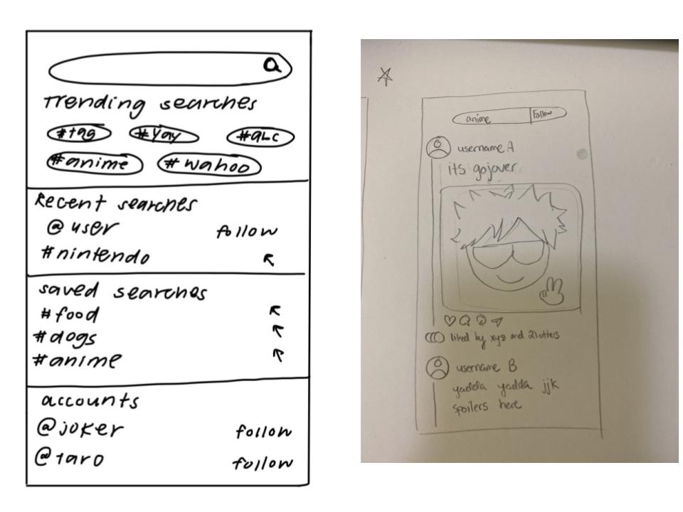
Sketches
Explore Page (Left)
Clear search bar at top — allows for ability to search for posts, users, keywords
Trending searches keywords / tags — shows immediate trending topics and personalized tags based on user algorithm
Recent searches — intuitive, easy to navigate to previous searches
Saved searches — intuitive, easy to navigate to saved searches for engagement on previous media
Accounts — recommends user accounts based on user algorithm and from Instagram data
Home Page (Right)
Similar to Twitter-style interactions on a post — username A posts a picture, as indicated by the line on the left of the interface
Clear display of post interactions — likes, comments, repost, share options available, with "liked by" similar to Instagram's display of who liked the post
Detailed Pages and Features
Explore & Search Functions
Explore Page (Left)
Finalized the concepts introduced in the ideation phase
Added trending page + For You section — increase engage-ability and personal content for users
Added Latest posts in relevant tags — increase user interest and community in the personalized material for users
Search Bar Page (Right)
Changed search bar page to Recent + Saved — similar to Instagram, search for content instead of being limited to just searching for other user accounts
Similar UI and interface to Instagram — familiar space to those joining Threads from Instagram, keeps the product branding and design

Home & Profile Features
Home Page (Left)
Finalized the concepts introduced in the ideation phase
Reformatted posts with clear line distinctions — intuitive UI for separating posts, the user who posted, and the post itself
Enlarged blue post button — remind and encourage users to post and builds product branding as a posting app
Profile Page (Right)
Removed original "Reposts" and replaced with "Saved" section instead — allows for users to share, repost, or interact further with previously saved posts
Reposts show up under "Threads" now — repost UI similar to Twitter and Tumblr for intuitive interface and interaction

Conclusion
If I were to redo this project with more time and resources, I would…
Refining features (filter feed, sorting posts, managing posts, etc.) — thinking more deeply about integrations and smaller details of the interactions in the app
Adding a profile customization option — allows for more creativity and personalization for users
Explore interface for creating a post — this is one page / interface that my team and I decided not to focus on due to time constraints, but it would be a great opportunity to revisit this and think about any potential pain points or areas of improvement for this page
Conduct user testing — gain real feedback on what areas of our design succeeded or failed to meet expectations according to user wants, needs, and behaviors
Create more iterations and prototypes — a great final design depends on its early stages; I would want to create multiple variations of designs and combine successful features from each to create a more innovative final interface
Ultimate Takeaways
What I learned the most…
Working in a team with a variety of platforms with different features — exploring apps and their similarities through competitive analysis and observation allowed me to gain a deeper understanding of design systems as a whole. Understanding how other successful products on the market balance function and aesthetics is crucial for redesigning an app to be just as intuitive, human-centered, and user-friendly.
Keeping in mind the purpose and intention behind designs, the core being the users — from start to finish I kept the audience in mind during the design process, focusing especially on the user needs and pain points to create a more user-friendly, intuitive, and engaging interface. I also designed keeping Threads' integration with Instagram and other apps in mind, and how familiar interfaces and functionalities from similar apps may bring more user engagement and retention within Threads.
Working with a mobile interface — this was my first time designing for a mobile interface. It was so exciting and such a great learning experience to work with a mobile app interface, as its functionalities, features, and design choices differ from web designs.
Introduction
Instagram Threads, a popular social networking platform, experienced rapid growth upon its launch on July 31, 2023. Users were initially engaged, spending an average of 20 minutes per day. However, within just a few months, user engagement decreased significantly, dropping to 18% of its peak, as reported by Sensor Tower.
The main issues here are:
How might Instagram Threads enhance user retention and boost their daily active user numbers to regain and surpass their initial levels of engagement and popularity?
(challenge): How might Threads leverage its integration with Instagram and other Facebook-owned platforms to enhance user engagement and retention?
This 4 week design sprint and unsolicited redesign of Meta's Threads app reimagines the user experience with a focus on a streamlined navigation, enhanced accessibility, and intuitive interaction.
Project Duration
October 2023 - November 2023 | 4 weeks
Team
4 Designers
Completed at Design Interactive, a student-run design consultancy at UC Davis that helps solve pressing challenges for businesses and nonprofits.
Role
UX Designer
UX Researcher
Tools
Figma
Google Suite
Slack
Research
Review Analysis
I conducted a detailed review analysis based on 177,000+ App Store reviews of the Threads app. Strengths and weaknesses of the app are noted below.
Strengths | Weaknesses |
|
|
Competitive Analysis
I also conducted competitive analysis, comparing the feedback from Threads to similar apps such as Twitter, Tumblr, and Instagram.
Tumblr | ||
|---|---|---|
|
|
|
Key Takeaways
Poor navigability — incorporating a search feature including the ability to search for hashtags, new users, and keywords would create increased navigability
Limited accessibility to personalized experiences — incorporating a main relevant trending section + explore page for personalized material and increased community engagement in-app. Also focuses more on personal algorithm to declutter random un-relevant posts
Unintuitive interaction on posts — implementing a more user-friendly interface involving greater attention to detail to likes, comments, reposting abilities, bookmarking abilities
Sketches
Explore Page (Left)
Clear search bar at top — allows for ability to search for posts, users, keywords
Trending searches keywords / tags — shows immediate trending topics and personalized tags based on user algorithm
Recent searches — intuitive, easy to navigate to previous searches
Saved searches — intuitive, easy to navigate to saved searches for engagement on previous media
Accounts — recommends user accounts based on user algorithm and from Instagram data
Home Page (Right)
Similar to Twitter-style interactions on a post — username A posts a picture, as indicated by the line on the left of the interface
Clear display of post interactions — likes, comments, repost, share options available, with "liked by" similar to Instagram's display of who liked the post
Detailed Pages and Features
Explore & Search Functions
Explore Page (Left)
Finalized the concepts introduced in the ideation phase
Added trending page + For You section — increase engage-ability and personal content for users
Added Latest posts in relevant tags — increase user interest and community in the personalized material for users
Search Bar Page (Right)
Changed search bar page to Recent + Saved — similar to Instagram, search for content instead of being limited to just searching for other user accounts
Similar UI and interface to Instagram — familiar space to those joining Threads from Instagram, keeps the product branding and design
Home & Profile Features
Home Page (Left)
Finalized the concepts introduced in the ideation phase
Reformatted posts with clear line distinctions — intuitive UI for separating posts, the user who posted, and the post itself
Enlarged blue post button — remind and encourage users to post and builds product branding as a posting app
Profile Page (Right)
Removed original "Reposts" and replaced with "Saved" section instead — allows for users to share, repost, or interact further with previously saved posts
Reposts show up under "Threads" now — repost UI similar to Twitter and Tumblr for intuitive interface and interaction
Conclusion
If I were to redo this project with more time and resources, I would…
Refining features (filter feed, sorting posts, managing posts, etc.) — thinking more deeply about integrations and smaller details of the interactions in the app
Adding a profile customization option — allows for more creativity and personalization for users
Explore interface for creating a post — this is one page / interface that my team and I decided not to focus on due to time constraints, but it would be a great opportunity to revisit this and think about any potential pain points or areas of improvement for this page
Conduct user testing — gain real feedback on what areas of our design succeeded or failed to meet expectations according to user wants, needs, and behaviors
Create more iterations and prototypes — a great final design depends on its early stages; I would want to create multiple variations of designs and combine successful features from each to create a more innovative final interface
Ultimate Takeaways
What I learned the most…
Working in a team with a variety of platforms with different features — exploring apps and their similarities through competitive analysis and observation allowed me to gain a deeper understanding of design systems as a whole. Understanding how other successful products on the market balance function and aesthetics is crucial for redesigning an app to be just as intuitive, human-centered, and user-friendly.
Keeping in mind the purpose and intention behind designs, the core being the users — from start to finish I kept the audience in mind during the design process, focusing especially on the user needs and pain points to create a more user-friendly, intuitive, and engaging interface. I also designed keeping Threads' integration with Instagram and other apps in mind, and how familiar interfaces and functionalities from similar apps may bring more user engagement and retention within Threads.
Working with a mobile interface — this was my first time designing for a mobile interface. It was so exciting and such a great learning experience to work with a mobile app interface, as its functionalities, features, and design choices differ from web designs.


Design Interactive: Threads Redesign
Available for Projects
Design Interactive: Threads Redesign
Available for Projects
Category:
Category:
Mobile Design
Client:
Client:
Meta - Threads (unsolicited redesign)
Introduction
Instagram Threads, a popular social networking platform, experienced rapid growth upon its launch on July 31, 2023. Users were initially engaged, spending an average of 20 minutes per day. However, within just a few months, user engagement decreased significantly, dropping to 18% of its peak, as reported by Sensor Tower.
The main issues here are:
How might Instagram Threads enhance user retention and boost their daily active user numbers to regain and surpass their initial levels of engagement and popularity?
(challenge): How might Threads leverage its integration with Instagram and other Facebook-owned platforms to enhance user engagement and retention?
This 4 week design sprint and unsolicited redesign of Meta's Threads app reimagines the user experience with a focus on a streamlined navigation, enhanced accessibility, and intuitive interaction.
Project Duration
October 2023 - November 2023 | 4 weeks
Team
4 Designers
Completed at Design Interactive, a student-run design consultancy at UC Davis that helps solve pressing challenges for businesses and nonprofits.
Role
UX Designer
UX Researcher
Tools
Figma
Google Suite
Slack
Research
Review Analysis
I conducted a detailed review analysis based on 177,000+ App Store reviews of the Threads app. Strengths and weaknesses of the app are noted below.
Strengths | Weaknesses |
|
|
Competitive Analysis
I also conducted competitive analysis, comparing the feedback from Threads to similar apps such as Twitter, Tumblr, and Instagram.
Tumblr | ||
|---|---|---|
|
|
|
Key Takeaways
Poor navigability — incorporating a search feature including the ability to search for hashtags, new users, and keywords would create increased navigability
Limited accessibility to personalized experiences — incorporating a main relevant trending section + explore page for personalized material and increased community engagement in-app. Also focuses more on personal algorithm to declutter random un-relevant posts
Unintuitive interaction on posts — implementing a more user-friendly interface involving greater attention to detail to likes, comments, reposting abilities, bookmarking abilities
Sketches
Explore Page (Left)
Clear search bar at top — allows for ability to search for posts, users, keywords
Trending searches keywords / tags — shows immediate trending topics and personalized tags based on user algorithm
Recent searches — intuitive, easy to navigate to previous searches
Saved searches — intuitive, easy to navigate to saved searches for engagement on previous media
Accounts — recommends user accounts based on user algorithm and from Instagram data
Home Page (Right)
Similar to Twitter-style interactions on a post — username A posts a picture, as indicated by the line on the left of the interface
Clear display of post interactions — likes, comments, repost, share options available, with "liked by" similar to Instagram's display of who liked the post
Detailed Pages and Features
Explore & Search Functions
Explore Page (Left)
Finalized the concepts introduced in the ideation phase
Added trending page + For You section — increase engage-ability and personal content for users
Added Latest posts in relevant tags — increase user interest and community in the personalized material for users
Search Bar Page (Right)
Changed search bar page to Recent + Saved — similar to Instagram, search for content instead of being limited to just searching for other user accounts
Similar UI and interface to Instagram — familiar space to those joining Threads from Instagram, keeps the product branding and design
Home & Profile Features
Home Page (Left)
Finalized the concepts introduced in the ideation phase
Reformatted posts with clear line distinctions — intuitive UI for separating posts, the user who posted, and the post itself
Enlarged blue post button — remind and encourage users to post and builds product branding as a posting app
Profile Page (Right)
Removed original "Reposts" and replaced with "Saved" section instead — allows for users to share, repost, or interact further with previously saved posts
Reposts show up under "Threads" now — repost UI similar to Twitter and Tumblr for intuitive interface and interaction
Conclusion
If I were to redo this project with more time and resources, I would…
Refining features (filter feed, sorting posts, managing posts, etc.) — thinking more deeply about integrations and smaller details of the interactions in the app
Adding a profile customization option — allows for more creativity and personalization for users
Explore interface for creating a post — this is one page / interface that my team and I decided not to focus on due to time constraints, but it would be a great opportunity to revisit this and think about any potential pain points or areas of improvement for this page
Conduct user testing — gain real feedback on what areas of our design succeeded or failed to meet expectations according to user wants, needs, and behaviors
Create more iterations and prototypes — a great final design depends on its early stages; I would want to create multiple variations of designs and combine successful features from each to create a more innovative final interface
Ultimate Takeaways
What I learned the most…
Working in a team with a variety of platforms with different features — exploring apps and their similarities through competitive analysis and observation allowed me to gain a deeper understanding of design systems as a whole. Understanding how other successful products on the market balance function and aesthetics is crucial for redesigning an app to be just as intuitive, human-centered, and user-friendly.
Keeping in mind the purpose and intention behind designs, the core being the users — from start to finish I kept the audience in mind during the design process, focusing especially on the user needs and pain points to create a more user-friendly, intuitive, and engaging interface. I also designed keeping Threads' integration with Instagram and other apps in mind, and how familiar interfaces and functionalities from similar apps may bring more user engagement and retention within Threads.
Working with a mobile interface — this was my first time designing for a mobile interface. It was so exciting and such a great learning experience to work with a mobile app interface, as its functionalities, features, and design choices differ from web designs.