Design Interactive: ScheduleBuilder Redesign
Available for work
Design Interactive: ScheduleBuilder Redesign
Available for work
Category:
Web Design
Client:
University of California, Davis (unsolicited redesign)

Introduction
UC Davis students use Schedule Builder every quarter to plan their academic schedules and sign up for courses. However, the organization of the site leads to a complicated learning curve. It takes a while for students to understand all that is offered, with some students utilizing a specialized Chrome extension to help their scheduling process.
The main issues here are:
How can we add / redesign features to make Schedule Builder more intuitive for planning?
How can we redesign Schedule Builder to be more efficient and accessible for course planning and scheduling?
This 6 week design sprint and redesign of Schedule Builder aims to utilize data-backed research to drive design decisions, leading to a more intuitive, accessible, and visually clear interface for students to plan their courses.
This was also my first ever UX project. My team and I were awarded the "Most-Human Centered Design" award out of 17 other teams.
Project Duration
April 2023 - June 2023 | 6 weeks
Team
3 Designers
Completed at Design Interactive, a student-run design consultancy at UC Davis that helps solve pressing challenges for businesses and nonprofits.
Role
UX Designer
Tools
Figma
Research
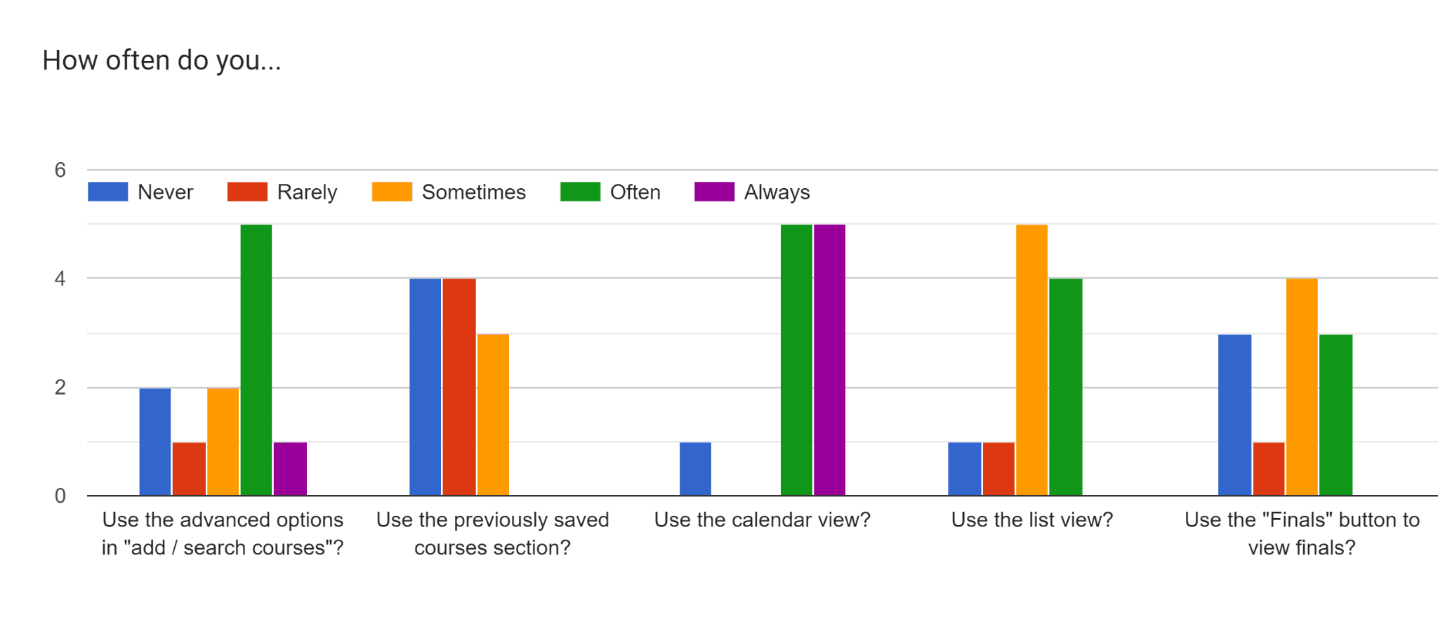
User Survey
"The views could be better, like list view and calendar view and such. It's also annoying every time you add a class, it refreshes." - Survey Participant
Users also thought that Schedule Builder did not clearly display schedule conflicts, and also most valued the ability to make multiple schedules which was not a feature in the current Schedule Builder interface.
Affinity Mapping & Direction
How might we…
Improve visual clarity and site navigability with emphasis on the list and calendar views?
Improve the efficiency of adding classes?

Ideation
How might we display schedule list and calendar list simultaneously without adding clutter?
Schedule list view and "add/search courses" will be displayed on the left side of calendar
Classes, and class conflicts, will be displayed on calendar view
How might we make prerequisites more obvious?
Web interface pops up from desired course
Prerequisites on the left side
Possibly which classes the course qualifies for on right

Mid-Fi Prototypes

User Testing & Iterations
Improved visibility / clarity of complete or required prerequisites:
Fixed the course details bar touching the very top of the screen:
Detailed Pages & Features
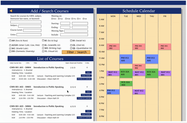
Making both the "advanced search" view and "schedule calendar" view more accessible to students by incorporating a side-by-side viewing experience:

Implemented a clear view of the class preview in the calendar schedule, including class conflicts:
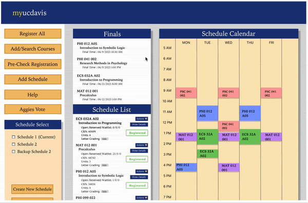
Clicking on the class in the schedule or calendar automatically brings up all course details, including prerequisites and details for that class:
Adding a compare schedule feature to directly compare course schedules side-by-side:
Conclusion
Takeaways
What I learned the most…
Gained experience with user research and analysis through survey responses
Learned how to integrate feedback into design functionalities
Learned about Figma's design and prototyping capabilities
Next Steps
If I had more time I would…
Implement a mobile-friendly design — an initial prototype is below

Flush out the schedule comparison feature for improved details
Improve the visual UI of the design (This was our first UX project ever, so we focused more on the research and usability aspect as compared to the visual design).
Introduction
UC Davis students use Schedule Builder every quarter to plan their academic schedules and sign up for courses. However, the organization of the site leads to a complicated learning curve. It takes a while for students to understand all that is offered, with some students utilizing a specialized Chrome extension to help their scheduling process.
The main issues here are:
How can we add / redesign features to make Schedule Builder more intuitive for planning?
How can we redesign Schedule Builder to be more efficient and accessible for course planning and scheduling?
This 6 week design sprint and redesign of Schedule Builder aims to utilize data-backed research to drive design decisions, leading to a more intuitive, accessible, and visually clear interface for students to plan their courses.
This was also my first ever UX project. My team and I were awarded the "Most-Human Centered Design" award out of 17 other teams.
Project Duration
April 2023 - June 2023 | 6 weeks
Team
3 Designers
Completed at Design Interactive, a student-run design consultancy at UC Davis that helps solve pressing challenges for businesses and nonprofits.
Role
UX Designer
Tools
Figma
Research
User Survey
"The views could be better, like list view and calendar view and such. It's also annoying every time you add a class, it refreshes." - Survey Participant
Users also thought that Schedule Builder did not clearly display schedule conflicts, and also most valued the ability to make multiple schedules which was not a feature in the current Schedule Builder interface.
Affinity Mapping & Direction
How might we…
Improve visual clarity and site navigability with emphasis on the list and calendar views?
Improve the efficiency of adding classes?
Ideation
How might we display schedule list and calendar list simultaneously without adding clutter?
Schedule list view and "add/search courses" will be displayed on the left side of calendar
Classes, and class conflicts, will be displayed on calendar view
How might we make prerequisites more obvious?
Web interface pops up from desired course
Prerequisites on the left side
Possibly which classes the course qualifies for on right
Mid-Fi Prototypes
User Testing & Iterations
Improved visibility / clarity of complete or required prerequisites:
Fixed the course details bar touching the very top of the screen:
Detailed Pages & Features
Making both the "advanced search" view and "schedule calendar" view more accessible to students by incorporating a side-by-side viewing experience:
Implemented a clear view of the class preview in the calendar schedule, including class conflicts:
Clicking on the class in the schedule or calendar automatically brings up all course details, including prerequisites and details for that class:
Adding a compare schedule feature to directly compare course schedules side-by-side:
Conclusion
Takeaways
What I learned the most…
Gained experience with user research and analysis through survey responses
Learned how to integrate feedback into design functionalities
Learned about Figma's design and prototyping capabilities
Next Steps
If I had more time I would…
Implement a mobile-friendly design — an initial prototype is below
Flush out the schedule comparison feature for improved details
Improve the visual UI of the design (This was our first UX project ever, so we focused more on the research and usability aspect as compared to the visual design).


Design Interactive: ScheduleBuilder Redesign
Available for Projects
Design Interactive: ScheduleBuilder Redesign
Available for Projects
Category:
Category:
Web Design
Client:
Client:
University of California, Davis (unsolicited redesign)
Introduction
UC Davis students use Schedule Builder every quarter to plan their academic schedules and sign up for courses. However, the organization of the site leads to a complicated learning curve. It takes a while for students to understand all that is offered, with some students utilizing a specialized Chrome extension to help their scheduling process.
The main issues here are:
How can we add / redesign features to make Schedule Builder more intuitive for planning?
How can we redesign Schedule Builder to be more efficient and accessible for course planning and scheduling?
This 6 week design sprint and redesign of Schedule Builder aims to utilize data-backed research to drive design decisions, leading to a more intuitive, accessible, and visually clear interface for students to plan their courses.
This was also my first ever UX project. My team and I were awarded the "Most-Human Centered Design" award out of 17 other teams.
Project Duration
April 2023 - June 2023 | 6 weeks
Team
3 Designers
Completed at Design Interactive, a student-run design consultancy at UC Davis that helps solve pressing challenges for businesses and nonprofits.
Role
UX Designer
Tools
Figma
Research
User Survey
"The views could be better, like list view and calendar view and such. It's also annoying every time you add a class, it refreshes." - Survey Participant
Users also thought that Schedule Builder did not clearly display schedule conflicts, and also most valued the ability to make multiple schedules which was not a feature in the current Schedule Builder interface.
Affinity Mapping & Direction
How might we…
Improve visual clarity and site navigability with emphasis on the list and calendar views?
Improve the efficiency of adding classes?
Ideation
How might we display schedule list and calendar list simultaneously without adding clutter?
Schedule list view and "add/search courses" will be displayed on the left side of calendar
Classes, and class conflicts, will be displayed on calendar view
How might we make prerequisites more obvious?
Web interface pops up from desired course
Prerequisites on the left side
Possibly which classes the course qualifies for on right
Mid-Fi Prototypes
User Testing & Iterations
Improved visibility / clarity of complete or required prerequisites:
Fixed the course details bar touching the very top of the screen:
Detailed Pages & Features
Making both the "advanced search" view and "schedule calendar" view more accessible to students by incorporating a side-by-side viewing experience:
Implemented a clear view of the class preview in the calendar schedule, including class conflicts:
Clicking on the class in the schedule or calendar automatically brings up all course details, including prerequisites and details for that class:
Adding a compare schedule feature to directly compare course schedules side-by-side:
Conclusion
Takeaways
What I learned the most…
Gained experience with user research and analysis through survey responses
Learned how to integrate feedback into design functionalities
Learned about Figma's design and prototyping capabilities
Next Steps
If I had more time I would…
Implement a mobile-friendly design — an initial prototype is below
Flush out the schedule comparison feature for improved details
Improve the visual UI of the design (This was our first UX project ever, so we focused more on the research and usability aspect as compared to the visual design).