1.1 - Market Research
My team and I first conducted market research by gaining an understanding and knowledge about what ATS and its market audience is. We learned about the significance and prevalence of ATS used by hiring managers, recruiters, and companies when receiving resumes. When applicants utilize ATS-friendly resumes, it heightens their chance of the resume being recognized in the application process to ATS standards. We found that of all the industries, the tech industry is one of the top industries taking the most advantage of the resume parsing algorithm. We also found that 99% of Fortune 500 Companies use ATS. After gaining this baseline knowledge, we determined a target audience of entry-level individuals.
1.2 - Competitive Analysis
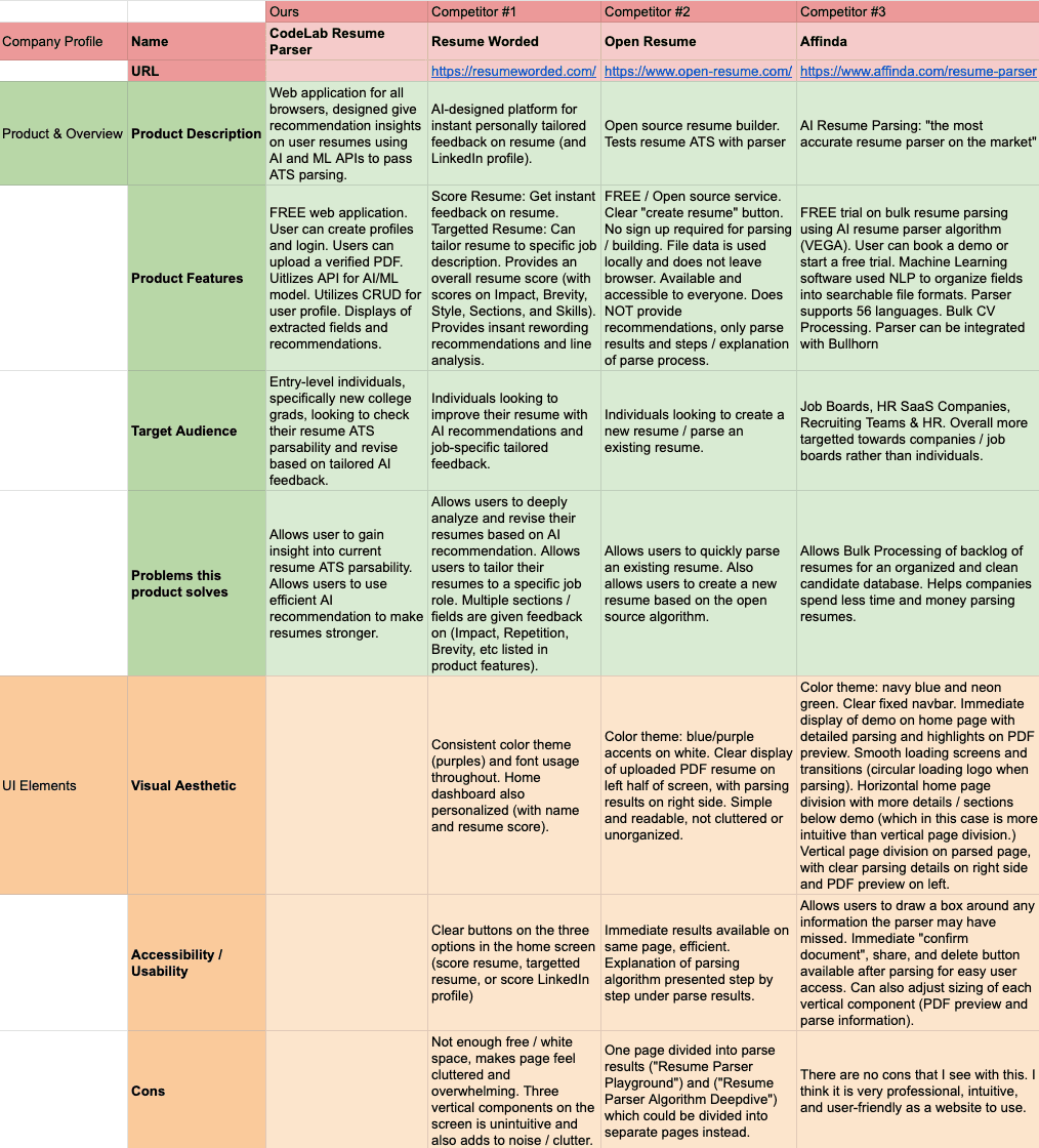
I compiled a spreadsheet to conduct competitive analysis on three competing resume parsers on the internet: Resume Worded, Open Resume, and Affinda. I compared their overall product features and overview, as well as their UI elements on the desktop version of their websites (as seen in the image spreadsheet below).
Key Findings
Resume parsing is mainly split into two categories — parsing based on content-specific information, and parsing based on formatting.
1.3 - User Survey
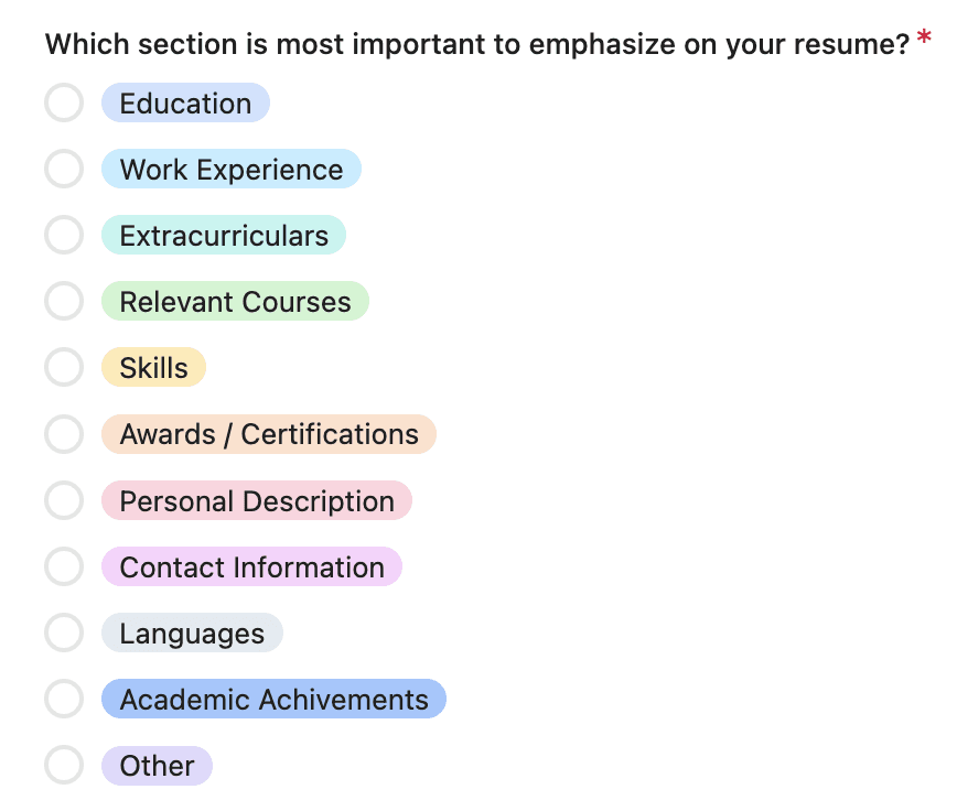
42 Responses to survey consisting of 19 questions, mixed multiple choice and open-ended questions. Sent out to an audience of college students and new grads.
Featured Questions:
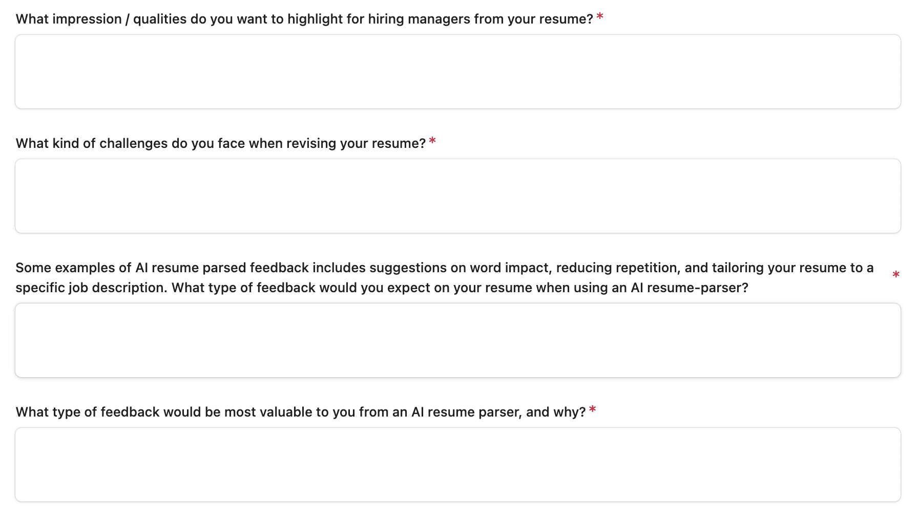
What type of feedback would be most valuable to you from an AI resume parser, and why?
What impressions / qualities do you want to highlight for hiring managers from your resume?
Some examples of AI resume parsed feedback includes suggestions on word impact, reducing repetition, and tailoring your resume to a specific job description. What type of feedback would you expect on your resume when using an AI resume parser?
What kind of challenges do you face when revising your resume?
Key Findings
Expected feedback from a resume parser consisted mainly of: repetition and word impact, including phrasing, action word implementation, and conciseness.
Most valued feedback from an AI resume parser consisted mainly of: tailoring resume to a specific job description.
2.1 - User Stories
As a User, I want to…
High Priority: See the feedback directly on my resume so that I can gain immediate visible results. Gain different types of feedback on the AI that is not just limited to a specific section in the resume so that I can gain feedback on my whole resume. Choose the type of feedback (content vs. ATS format) that I want to review first so I can focus on revising what is more important to me. Be able to tailor my resume to different job descriptions, so that I can have specific resumes for specific applications.
Medium Priority: Be able to see my past uploaded resumes, so that I can further revise them if needed.
Low Priority: Be able to upload multiple resumes at once.
2.2 - Wireframing
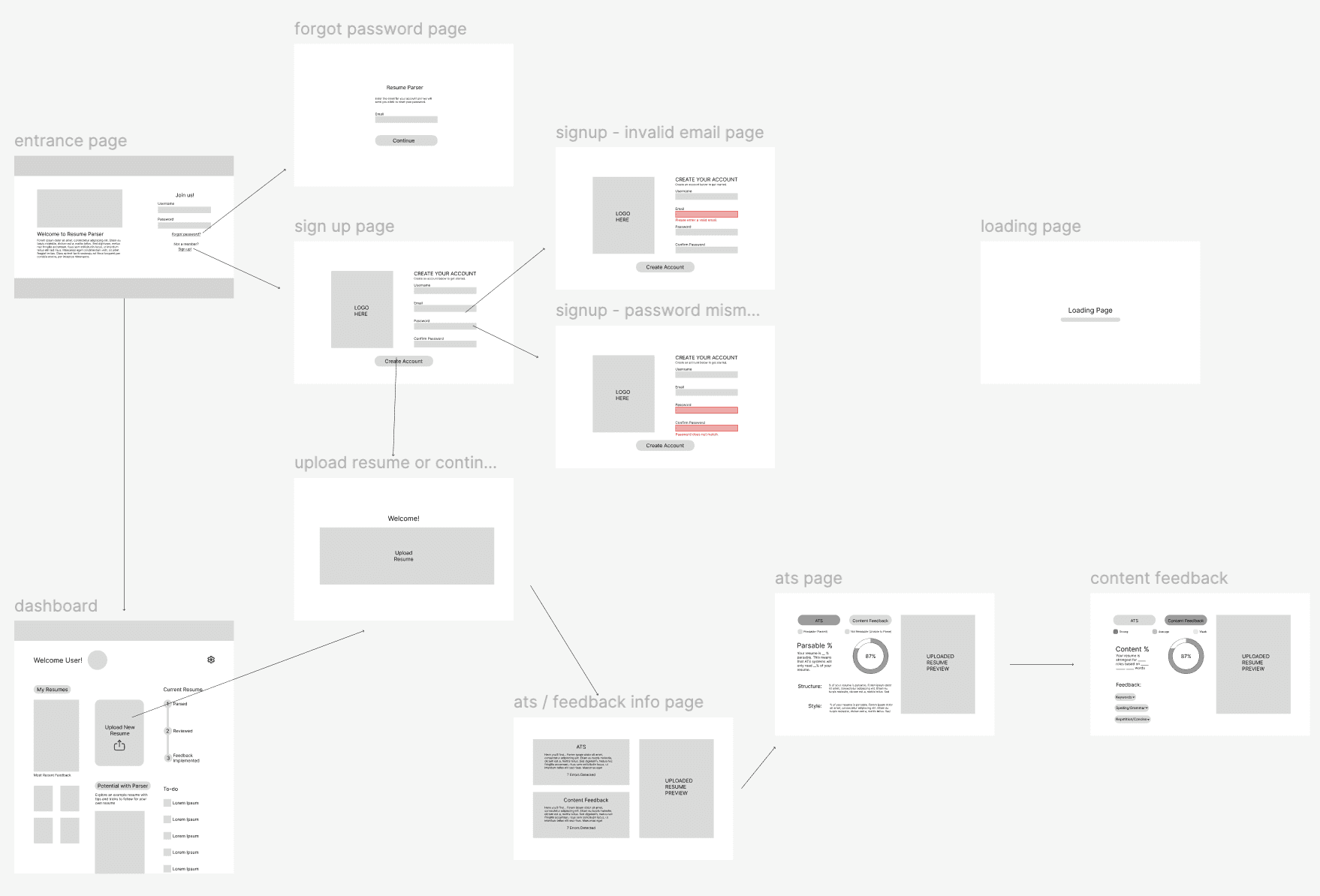
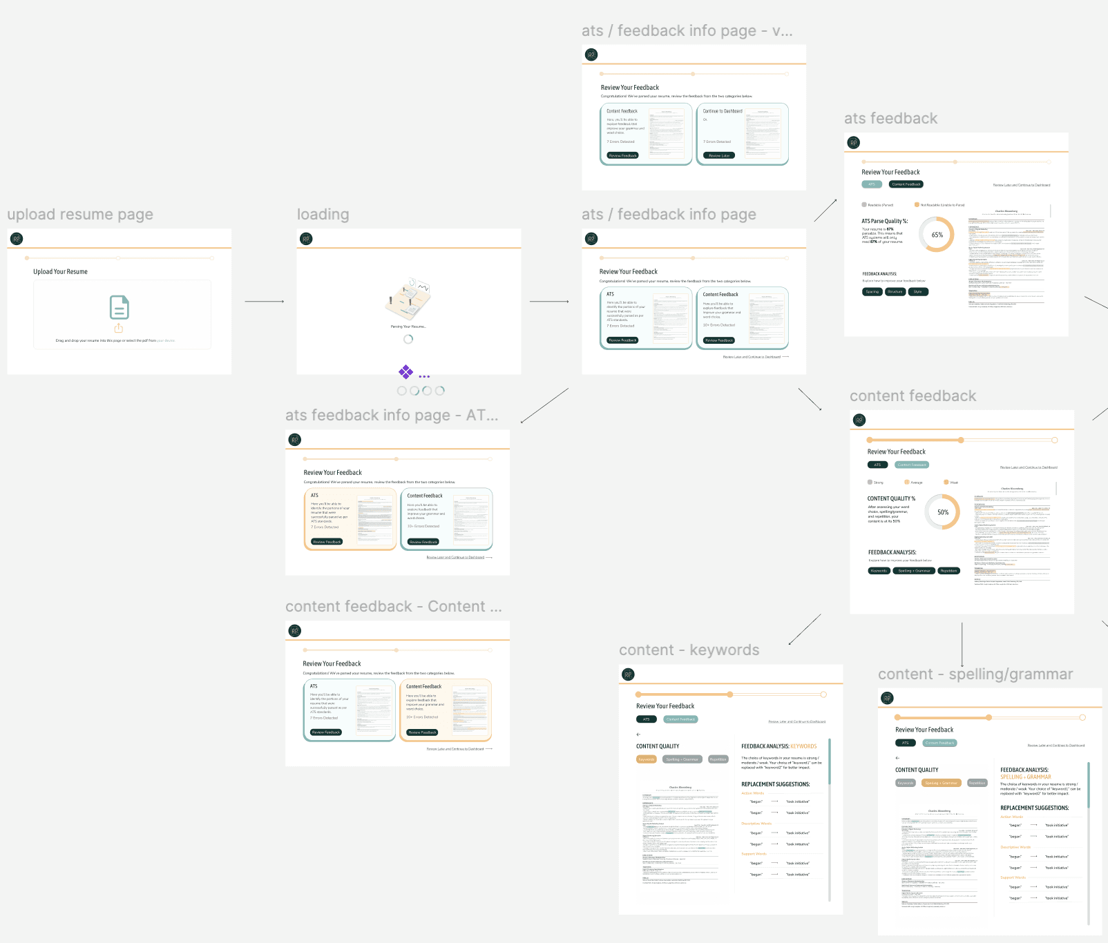
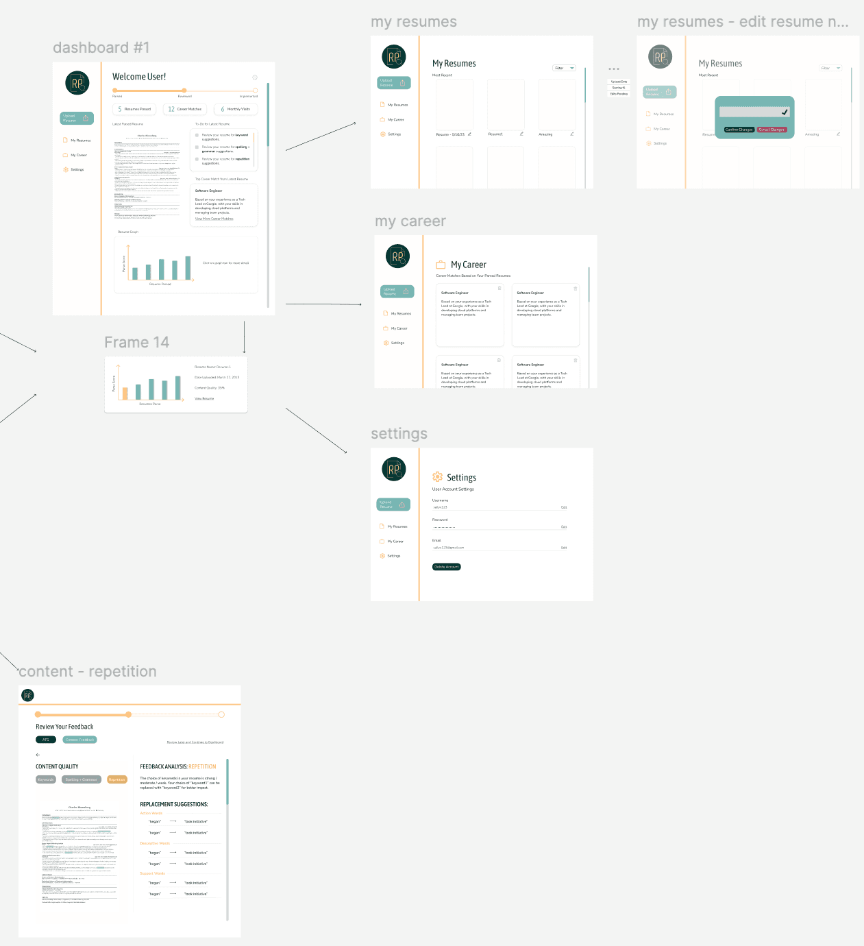
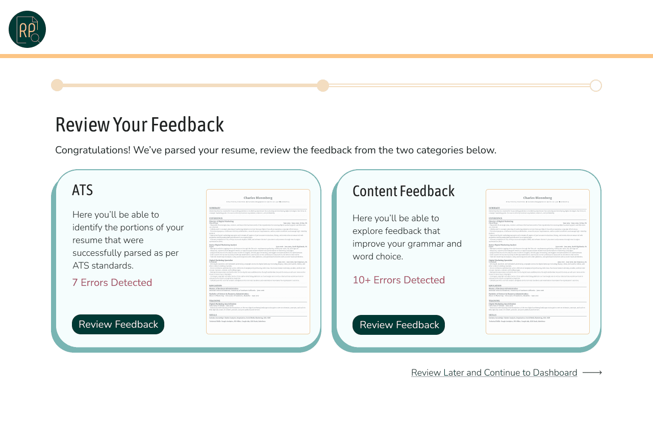
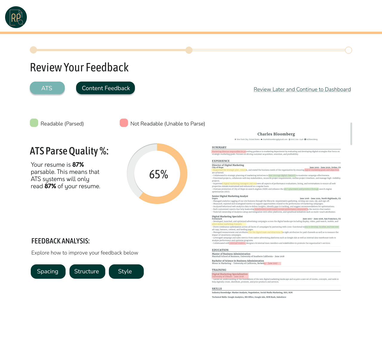
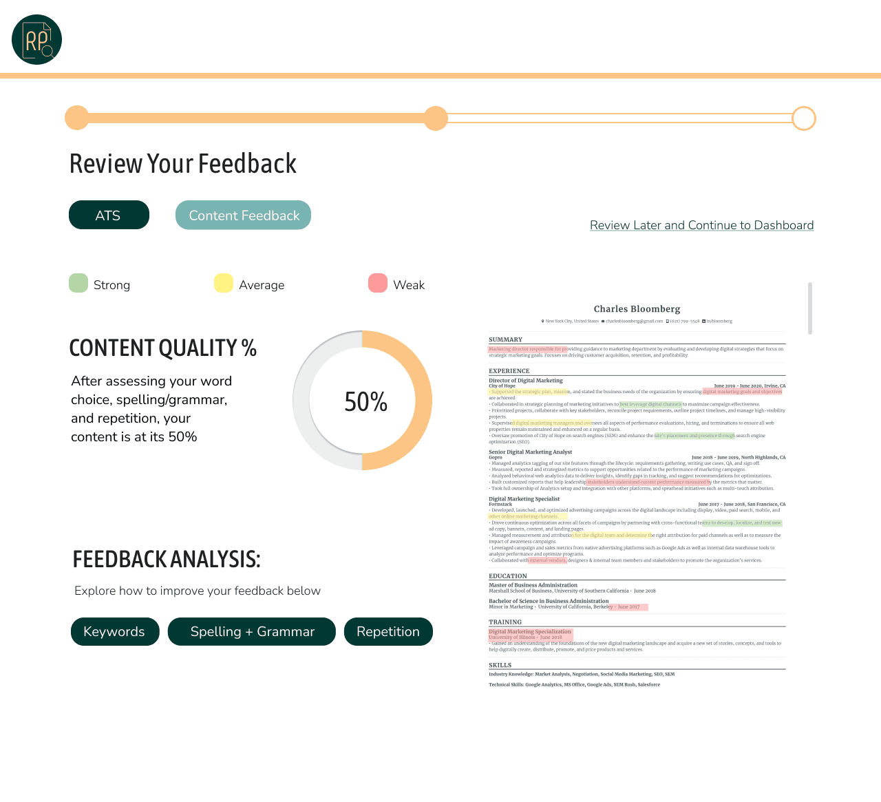
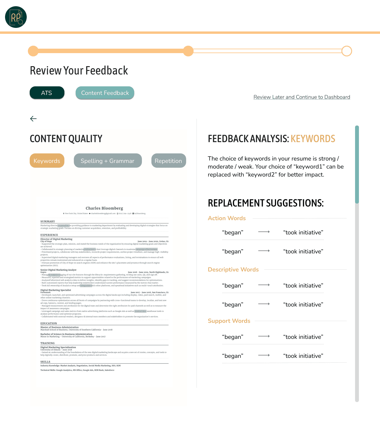
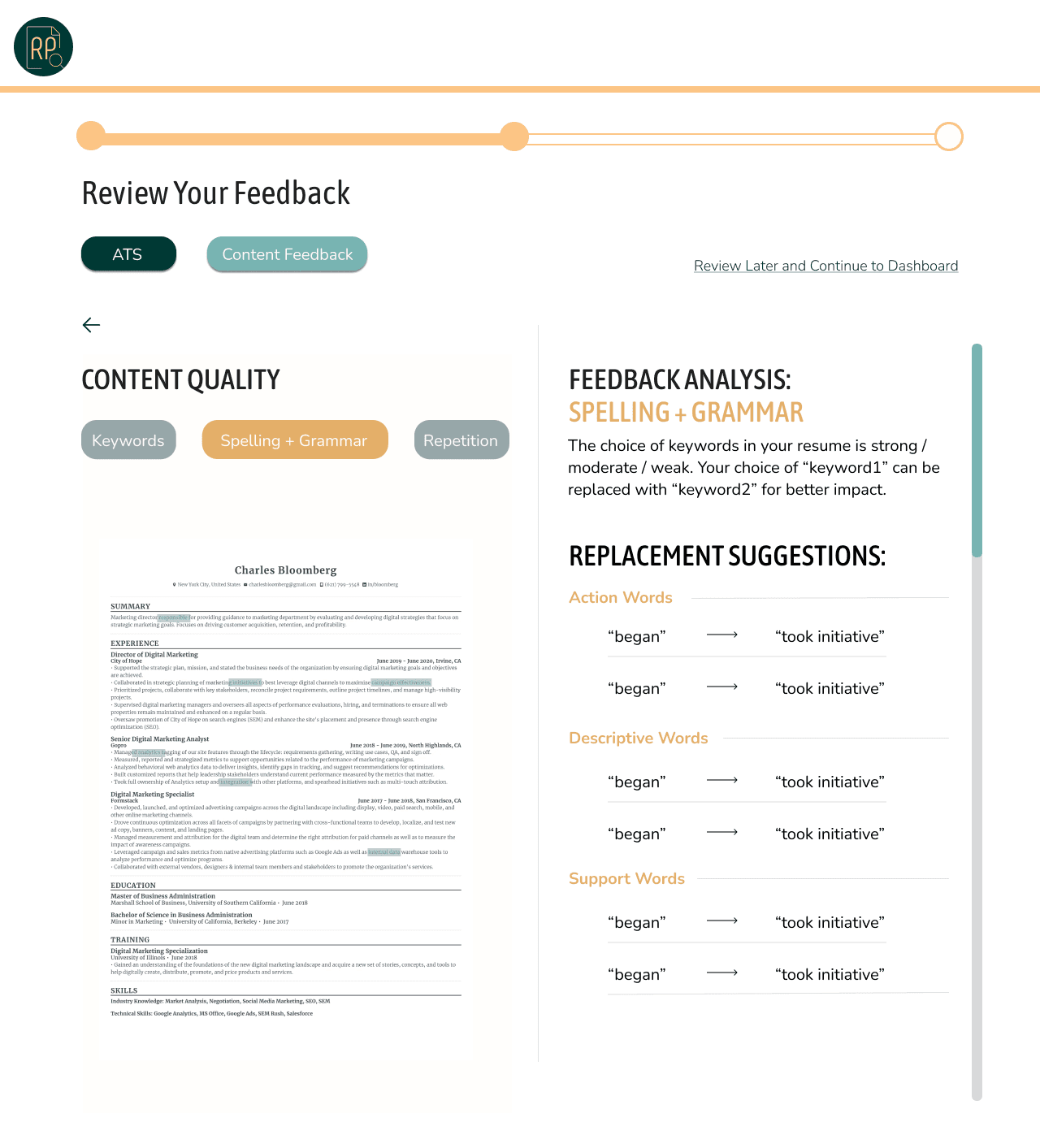
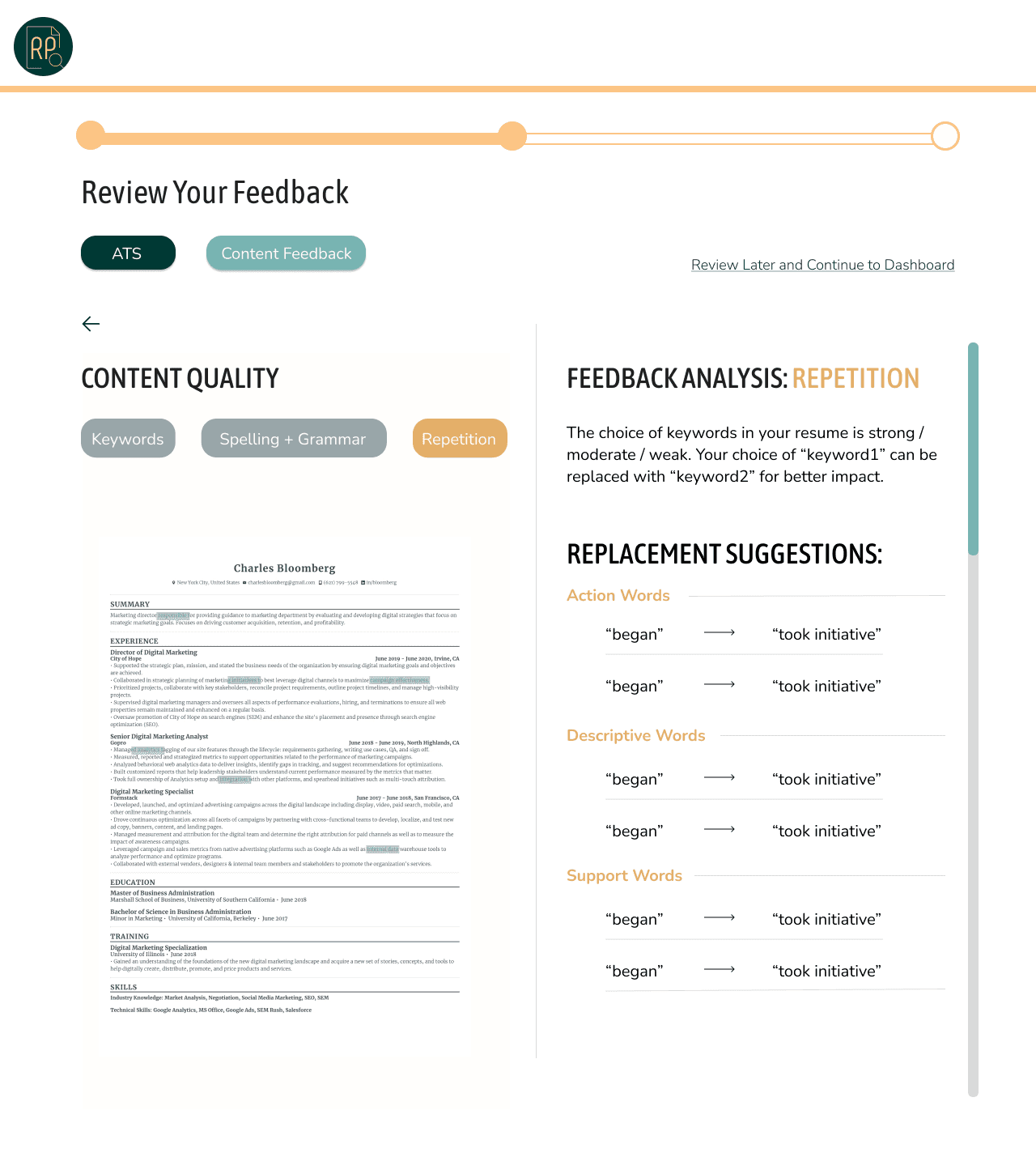
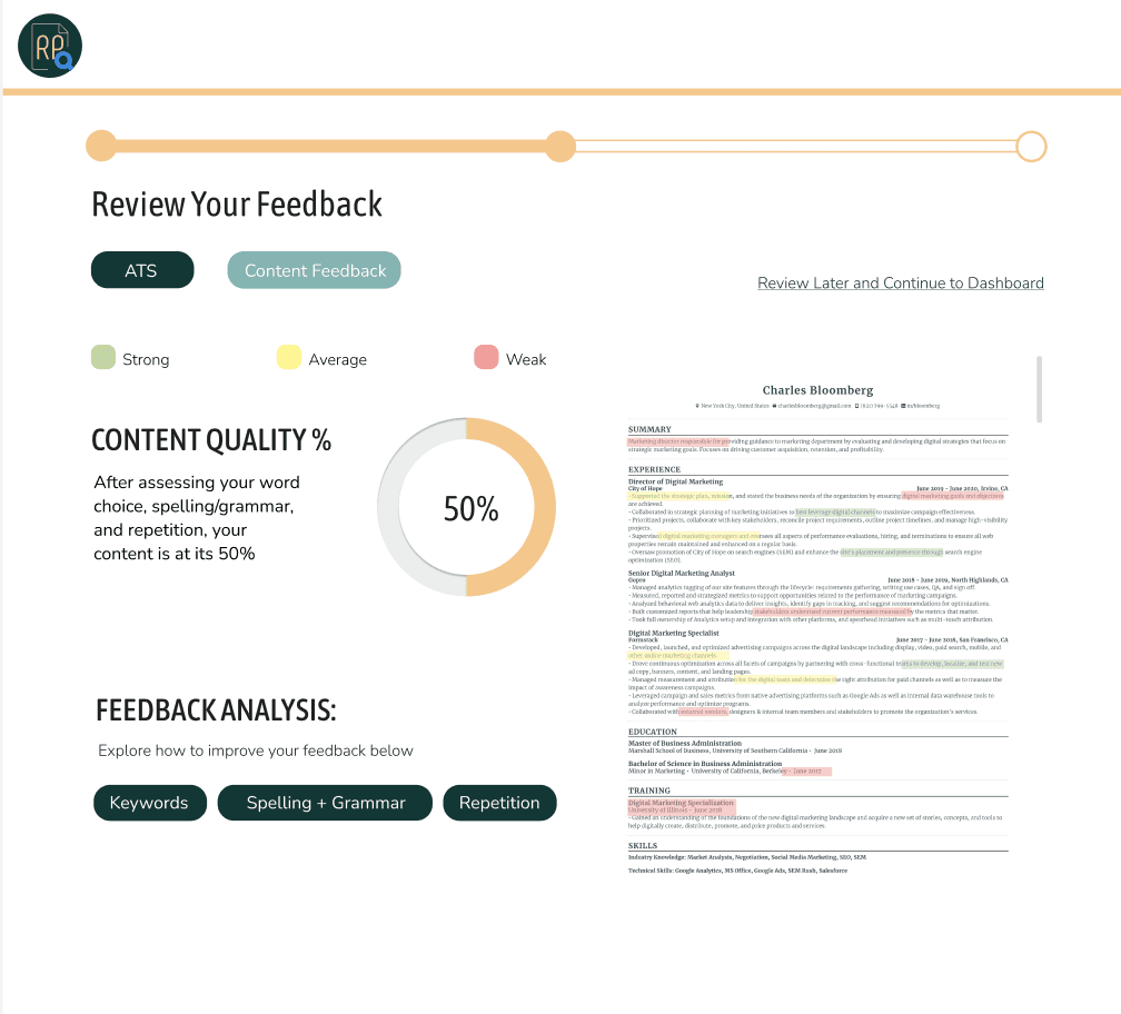
I referred to the key findings in the user surveys, and user stories to design the general flow and initial wireframes of the website flow. I focused especially on ensuring that there were two different parsing result pages — one for ATS formatting and one for content feedback. This ensured that I was meeting user wants and needs of having multiple types of parsing feedback, which is the main focus of Resume Parser.
3.1 - Design System
We focused on maintaining a friendly yet professional environment with the greens and yellows as part of the color scheme. It was important to adhere to this design system to maintain a consistent design environment, and to make prototyping more efficient for the team.



3.2 - Initial Prototypes
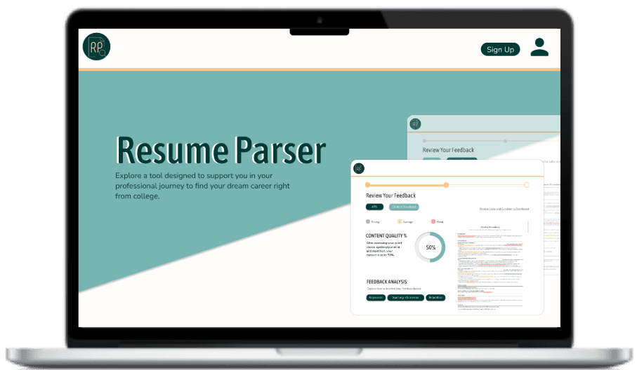
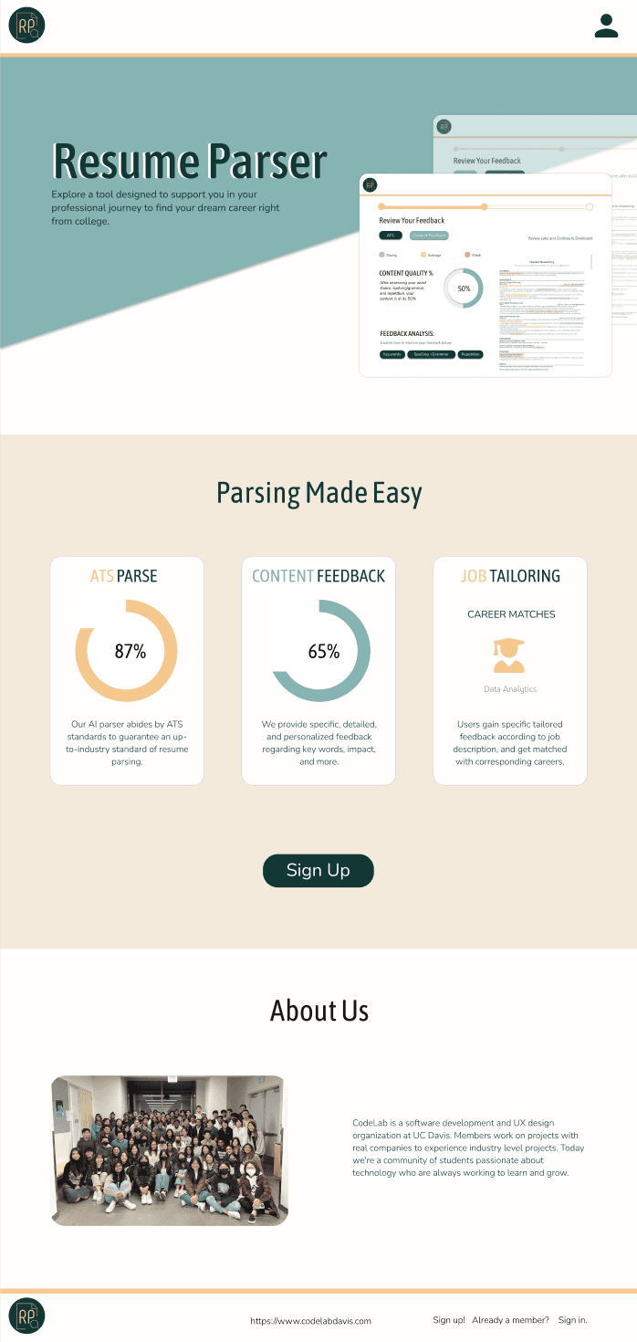
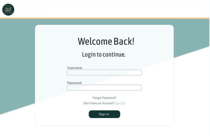
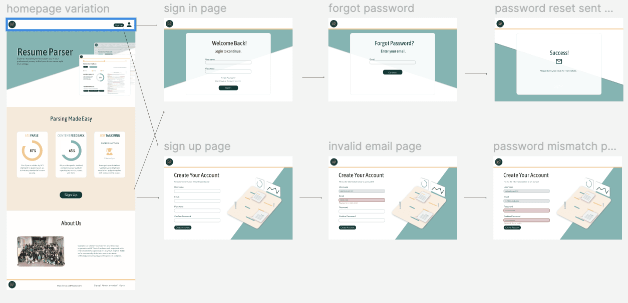
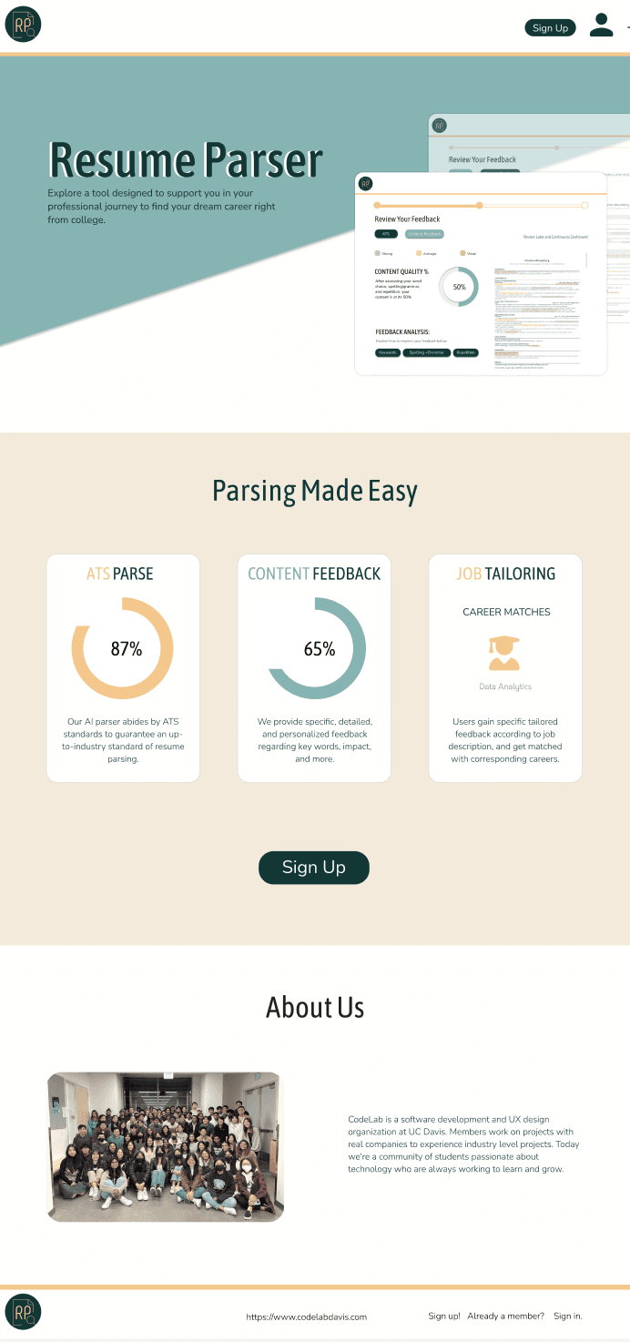
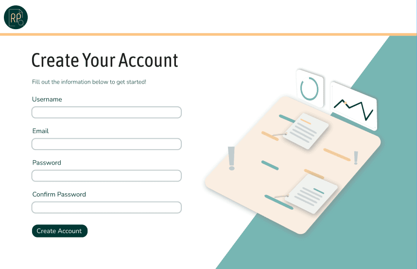
Our initial prototypes began with the home screen, sign in page, and sign up page.
3.3 - Usability Testing
I conducted usability testing on 4 individuals for the above home, sign in, and sign up pages.
Home Page Questions:
How would you categorize the icons seen on the header, where do you believe they would lead?
After reading this page, do you have a good understanding of what a resume parser does?
Sign Up/In Page Questions:
What made completing this task (signing in or signing up) a good experience for you?
Was the language and instructions on the page easy to understand?
What would you rate how simple and clean the interface was? (scale 1-10; 1 being bad, 10 being amazing) What influenced your rating?
Key Findings
Users valued simple and clean visual interface of the website.
It is unintuitive to scroll down in order to sign up, as the person icon in the navbar is not explicit in its function for signing up in addition to being able to sign in.
4.1 - Handoffs & Adaptations
ATS vs. Content Feedback
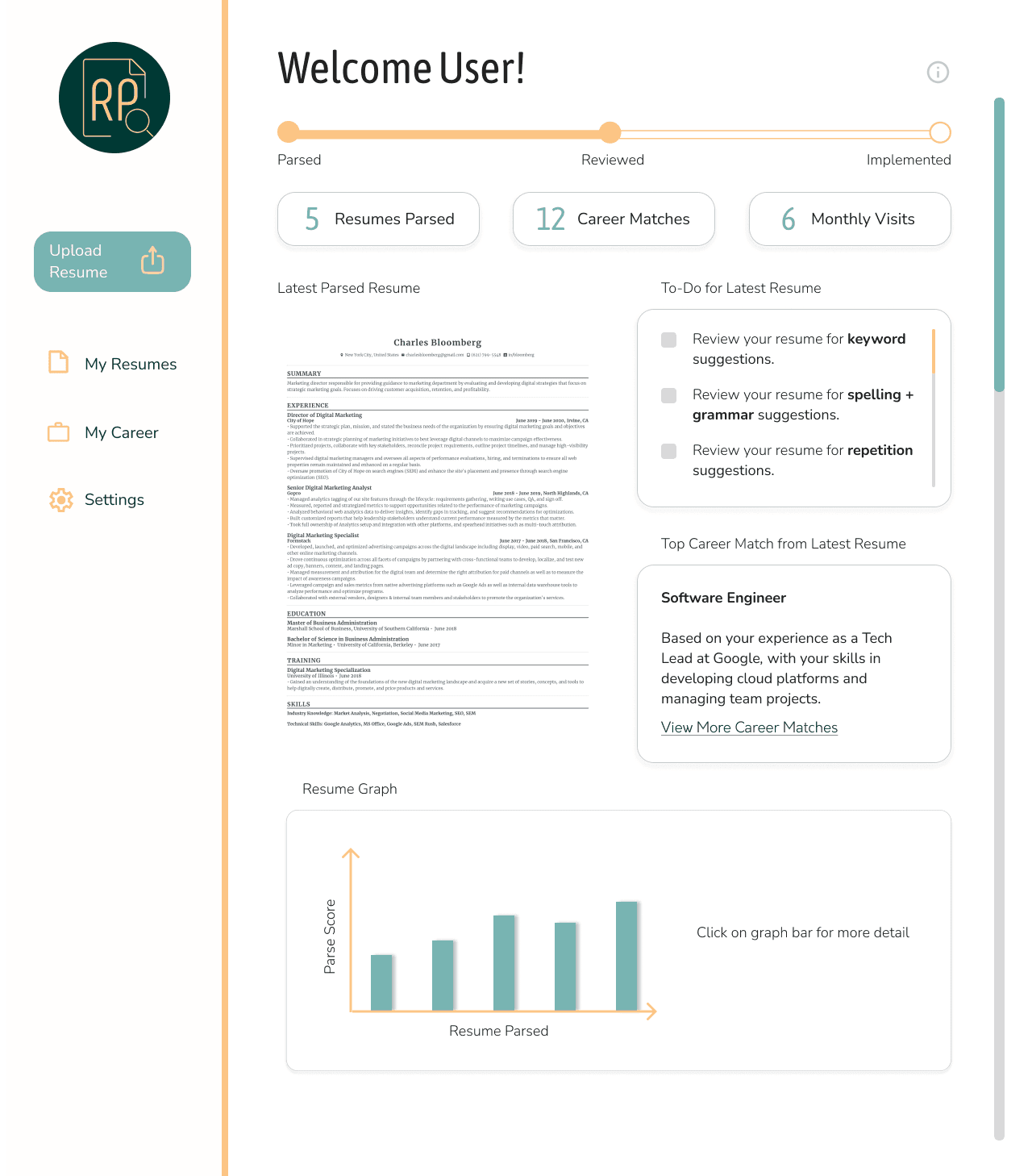
At the time of handoffs to developers, there were some adaptations to be made based on the project scope and timeline deadlines.
4.2 - Final Designs
5.1 - Learnings
Provided opportunity to conduct first-hand user research and user testing, including competitive analysis, user surveys, and usability testing.
This project required tremendous collaboration, time-management, and team collaboration skills.
First full-fledged project, utilizing five-step design process in the span of 20 weeks.

